


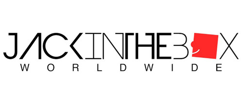
Here’s why we redesigned Jack in the Box’s visual identity.
#WHATELSE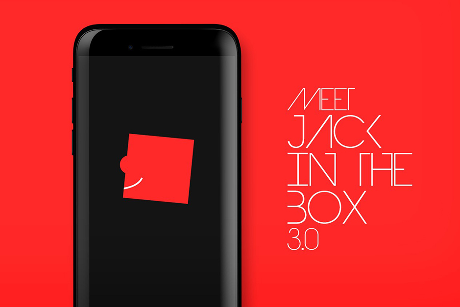 Krishnaa Artisto • December 15, 2016


Well, someone had to do it… >_<
First of all, why the change?
When I applied for a job at Jack in the Box Worldwide back in 2012, there was something about the way the website looked, with its crazy clown-faced logo that changed who I am today!
I got the job, in case you’re still wondering, back when we were more of a social + content marketing company. Fast-forward 5 years, and we’ve become one of the best content distribution digital agencies in India, if not the world.
We’ve evolved as a business, as a company, and so has our design philosophy for our in house brands and clients.
We discovered along the way that the logo needed some work, to fit in an evolving digital media.
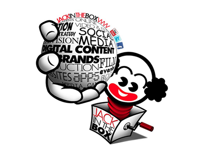
Our Web 2.0 logo looked dated. The ‘Jack’ out of the box with the globe full of digital archetypes was everything that a logo shouldn’t be. Not saying it was all bad, but you get what I am saying.
Maybe it worked back then because Facebook was THE thing, and you could upload a long big profile pic. By the way, we were pretty great at social media #JustSaying.
How long did it take me to come up with a final version?
Most founders or CEOs aren’t the most creative people, in my opinion, but Jack in the Box’s CEO, Roopak Saluja, has a keen eye for design. On branding projects it usually took me some 10-15 iterations to get it right but for Jack in the Box, it came together quickly, thanks to that subtle grin which worked like a wink.
My inspirations for the logo redesign?
The process started with curating references for the font and icon which had to be unique to us and would age well. It had to look very ‘digital’ with an edge to it. Logos today are getting simpler and more material by the day and just like apps, even logos are starting to look very similar which isn’t how a logo should work. A great logo should be unique to help drive brand recall.
My first go-to inspiration was Fantasy Interactive, a UX and UI design agency in NY. It has a very similar colour palette and looks minimal yet ahead of its time.
Coming to the icon, I attempted to retain the clown but felt that I was making a similar mistake of creating a logo that wouldn’t work across all platforms and devices.
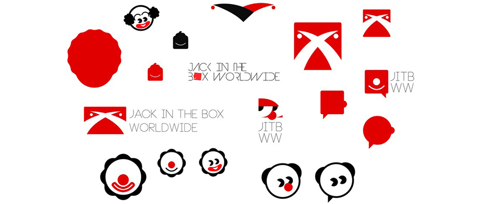
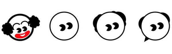
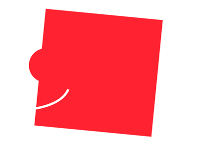
Since the clown extension was going nowhere I picked the more minimal cue of the clown smile (below).
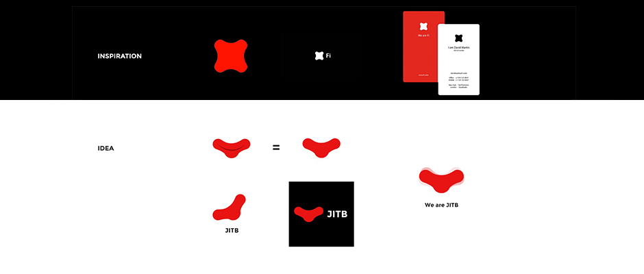
That got too complex and it didn’t feel like a concept that everyone could understand. So I took a more drastic jump and changed the icon completely retaining two elements – the ‘box’ and the ‘smile’. By this stage I also found the font that I was looking for. A futuristic unique font that could blend well with the hot red icon.
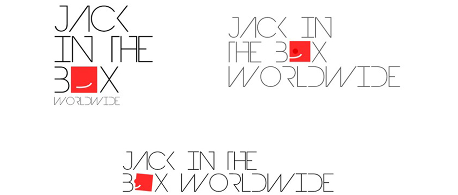
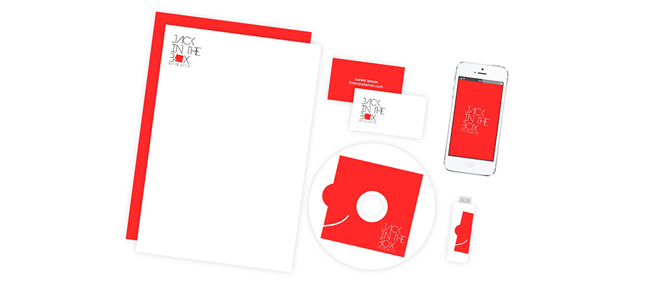
Confident with this choice, I explored some collateral options and it looked appealing.
Advantages of the new logo?
The main advantage is that it is a digital unit – it looks perfect for something as small as a ‘fav icon’ and also great for oversized placements in presentations. Our new logotype is a sans-serif typeface and maintains the playfulness in its abrupt breaks. It is smart, quirky, minimal, versatile and definitely raises eyebrows. Oh, and Roopak loved it right from the start!
What do you think?
Check out more in #WHATELSE
World Aids Day